
With a new big game release comes, of course, another controversy, though luckily with this one nobody is being hurt.
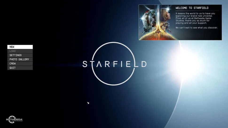
Recently people have started popping up online to lambast the menu screen of the soon to be released Starfield that you see above. The menu is simple, to the point and doesn’t use a lot of screen space for the actual menu options. I actually quite like the design, it reminds me of a desktop wallpaper, but it seems as though many are calling the design lazy and uninspired.
Now, I don’t know about you, but when I think of a space game, I think of making the main menu seem vast, empty and ominous, a bit like what this is projecting, not having action shots or stylised menu fonts or such like Persona. As such I think the menu is fine for this kind of game, but in general I think that people complaining about menus are simply looking for some kind of excuse to complain about a, let’s be honest, very minor issue. There aren’t many experiences I have found in which the main menu has ruined some part of an experience for me… though maybe I just haven’t found a bad enough one yet.
So what do you all think? Is this menu bad, and do certain game menus make for bad games? Let us know in the comments! That’s all for now, and as always. It’s not just a game, It’s a Life.